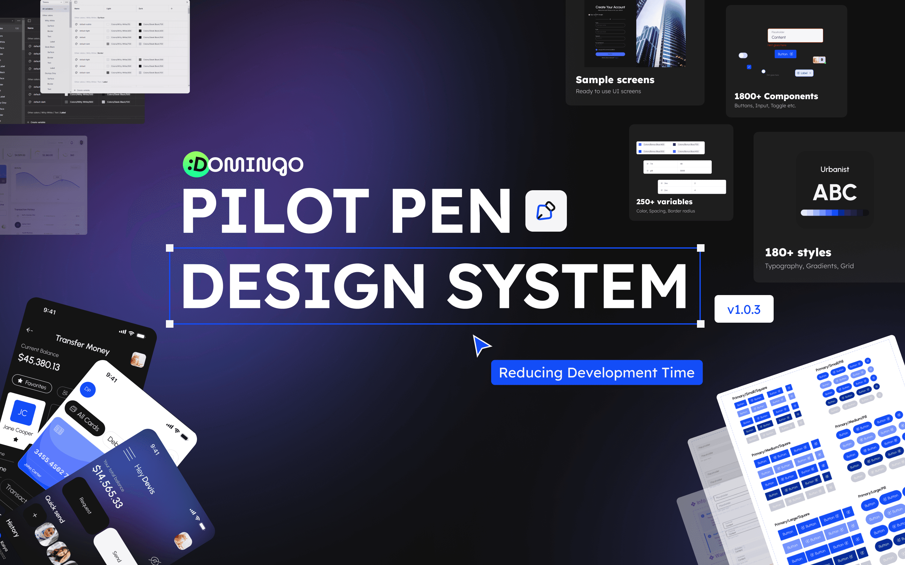
In the fast-paced world of fintech, speed is crucial. Teams are always under pressure to deliver high-quality products quickly while maintaining accuracy and regulatory compliance. This is where Pilot Pen, a comprehensive fintech-focused design system built in Figma, comes in. By streamlining the design-to-development workflow, it helps companies significantly reduce development cycles without compromising on quality or user experience.
Pre-Built, Ready-to-Use Components : The core of Pilot Pen’s time-saving magic lies in its vast library of pre-built, customizable components like buttons, text inputs, modals, avatars, and grids. Each element is meticulously designed for fintech, adhering to industry standards and ensuring regulatory compliance. Teams no longer need to create UI components from scratch—just drag, drop, and customize.
Standardized Design Tokens : The design system also leverages design tokens, which standardize elements like color palettes, typography, and spacing across the product. This ensures a cohesive look and feel throughout your platform and removes the need for back-and-forth discussions about minor styling inconsistencies.
Collaboration Made Easy: Built in Figma, Pilot Pen allows designers and developers to work together in real time. Designers can make updates, and developers can immediately see how those changes will affect the final product. No more tedious handovers or mismatches between design and development—everything syncs up perfectly.
Rapid Prototyping: Pilot Pen enables quick prototyping with its component-based design system. Designers can mock up entire user flows in hours rather than days, getting rapid feedback from stakeholders or customers. This cuts down on multiple iterations, saving both time and resources.
Scalability and Consistency: With fintech products, scalability is key. The Pilot Pen design system ensures that as your product grows, new features can be added without disrupting the existing structure. Every component follows a consistent pattern, ensuring that both small updates and large-scale rollouts maintain brand consistency and usability.
Reducing development time isn’t just about speed; it’s also about minimizing errors. By providing a unified design language and pre-validated components, Pilot Pen reduces the likelihood of bugs caused by inconsistent design or miscommunication between designers and developers. This leads to quicker releases and fewer costly post-launch fixes.
What makes Pilot Pen stand out is the ongoing support and updates that ensure your product remains cutting-edge. As fintech regulations and design trends evolve, so does the design system, making it a future-proof solution for your product.
In an industry where time equals money, Pilot Pen drastically reduces the time it takes to move from ideation to implementation. With a vast array of pre-built, compliant, and customizable components, collaboration-friendly tools, and scalability in mind, this design system for Figma ensures your fintech products can launch faster without compromising on quality.
RELATED POSTS
HAVE AN IDEA ?
LET'S TALK.
We create experiences that fuel connections between brands and the people vital to their success.


